Error - It's not possible for you to be here
Warning contains some minor spoilers.
The 2016 science fiction film Passengers is full of bad design. More specifically bad interaction design. There are pockets on the web dedicated to the great user interfaces portrayed in sci-fi movies. But there is very little on the sorry state of interaction design. It’s a fair argument to say that any interaction design in a film is simply there to fulfil a plot device and it’s really not worth anytime thinking (never mind writing) about. But, uh, I’m going to anyway.
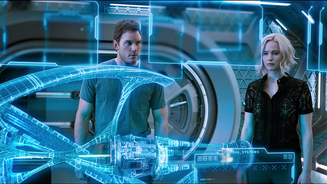
The protagonist Jim is travelling with thousands of other passengers onboard a space ship headed to colonise a new planet. From Earth the journey will take 120 years and so the people on the ship have to travel the majority of the journey in controlled hibernation. However due to a technical error Jim wakes up 90 years too early. We then follow him as he tries to figure out how to go back into hibernation. We see him interacting with the ship’s computers via beautiful looking touch screens and seamless voice interactions. Seemingly a great deal of time has been spent by the ship’s designers creating these interfaces. However, and here’s the rub, they spent no time designing for the scenario of a passenger waking up too early. An assumption was made that the ‘Hibernation pods are fail-safe, they never malfunction’. The computer functions as normal but when confronted with this error it has no way to deal with it. In fact its response is, ‘it’s not possible for you to be here’. Uh oh. That’s less useful than a ‘404 — page not found’.
Jim frantically tries to get help by sending a video message to the ‘Homestead Company’ back on Earth. Another smooth voice and touch screen interaction occurs whereby Jim records and sends his message. However it’s only after the message has been sent that the computer responds, ‘‘Message sent. Message will arrive in 19 years. Earliest reply in 55 years. We apologise for the delay. That will be $6,012’.
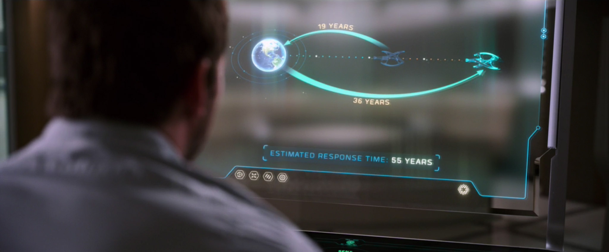
Well the message is transparent but it would have been more useful to know this before recording and sending the video. Feedback needs to be timely. Clearly Jakob Nielsen’s 10 principles for interaction design have gotten lost over the years.
The movie continues from one piece of bad design to another. Some more banal than others. The coffee machine requires Jim to login so it can determine his privileges. Despite obtaining his details the machine still presents options that aren’t available for his ticket class, ‘Sorry. The Mocha Cappuccino Extreme is reserved for gold-class passengers’. Jim is left pressing all the buttons until it finally serves him the only available option — bog standard coffee.
Jim’s frustrating interactions with the video messaging and coffee machines are funny (or at least intended to be). There’s so much bad design in our lives that we can all relate. But what happens when the same people who make our unusable self-checkout machines are making things that really matter. It’s not just the usability that needs to be considered but the ethical responsibilities as well.
The stories in science fiction are often used to express the fears of the day. In this film the faceless bad guys may be the ‘Homestead company’ but ultimately, bad design is the root cause of the problems. The message is don’t fear the CEO, the scientists or the engineers. Fear the designers.
(Also fear Jim. Jim is a real creep).